
Dustin Lennon
Applied Scientist
dlennon.org
Optimal Lending Club Portfolios
The paper characterizes an optimal, managed portfolio with annual returns in excess of 12%.
Dustin Lennon
October 2013
https://dlennon.org/20131001_olcp
This work was originally published as an Inferentialist white paper.
Abstract
Abstract
Lending Club is a relatively new, and fastly growing, peer to peer lending platform. Using historical data provided by the company, we describe a method for constructing optimial portfolios of Lending Club loans.
Our results, driven by expected returns, compare favorably to investment strategies based solely on the loan grade assigned by Lending Club. Our optimal, actively managed portfolios have an expected return exceeding 12% annually. In contrast, portfolios constructed on A-grade loans return 6.68%; B-grade loans, 7.49%; and C-grade loans, 8.11%.
Introduction
Introduction
Outline
We first establish a fundamental connection between survival curves and historical returns of a managed portfolio.
Next, we provide a high level overview of our algorithm which is based on a random forest adapted to a survival paradigm.
The algorithm outputs a per-loan expected survival curve as well as some indication of prediction uncertainty. The prediction uncertainty can be extended to a full variance estimate allowing near optimal portfolio construction via an efficient frontier-like calcuation.
We conclude with some model summaries, their implications for our results, and, finally, discuss some of the challenges of deploying our model.
Definitional Due Diligence
In the course of this analysis, unless specified otherwise, we restrict ourselves to actively managed portfolios. By this, we mean that coupons are immediately pooled and reinvested in an asset basket with identical statistical characterization. For example, we consider the collection of A-grade loans as though it were an index fund which (a) has statistical properties that are constant in time and (b) allows us to reinvest, at any time, in arbitrarily small amounts. The assumption is that we can always invest new money at baseline distributed over the whole asset class.
We also routinely refer to bootstrap samples. This is a familiar technique used within the statistical community, but it may be less well known elsewhere. The fundamental idea is to resample data, with replacement and typically many times over, to better understand how much variability exists in a particular estimate of interest. As an example, suppose you are interested in computing an average, a single number, of some data you collected. There is inherent variability associated with that number: if the experiment was repeated, it would yield different data and, hence, a different average. Bootstrapping allows for a characterization of that variability without performing a new experiment. It is particularly useful when an estimate is sensitive to the sample as might be the case in a dataset with large outliers.
The Connection Between Survival Curves & Returns
The Connection Between Survival Curves & Returns
In our first paper, On Lending Club Portfolios, we showed a version of Figure 1. This was in the context of characterizing the default risk, but we only hinted at the key connection between survival curves and historical returns, namely that survival curves can be viewed as a data reduction mechanism.
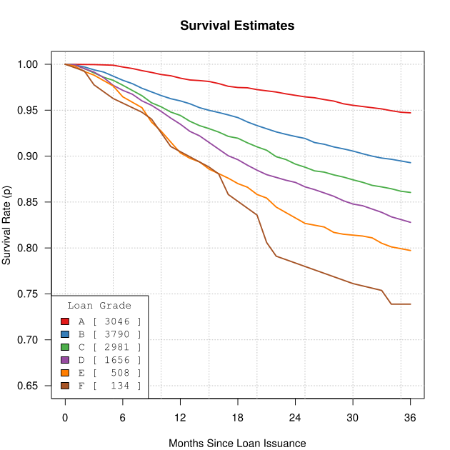
Consider that Figure 1 condenses the behavior of 12,115 loans into 6 smooth curves. This is a worthy accomplishment only if we can use the survival curves to recover the estimates we care about. In our case, that’s the historical returns column displayed in Table 1. In fact, this reconstruction property plays a central role in classical statistics, and is known as a sufficient statistic: if we reduce the data to some summary statistic, can we recover a particular estimate from just the reduced data? For a suffient statistic, the answer is yes.
Our approach will be to generate a collection of simulated portfolios for each loan grade. A simulated portfolio will be of the same size as the corresponding set of graded loans, and will incorporate two sources of randomness: default time and interest rate.
We use the survival curves to transform random uniform(0,1) realizations into default times. For example, a simulated grade-D loan with a uniform realization of 0.85 would default at month 30 whereas a value of 0.83 or lower would mean it survived the full term—this is because 83% of the time, a realization from a random uniform(0,1) is less than 0.83, and we want this to coincide with how frequently grade-D loans survive the full, 36 month term.
A simulated portfolio also relies on interest rates as well, and these are assigned via bootstrap sampling from the appropriate loan-grade class.
In this way, we generate many simulated portfolios for each loan grade. Each simulated portfolio has a corresponding return, and these returns can be aggregated into a density estimate, or histogram.
The results of the simulation are shown in Figure 2. Here, the curves are the density estimates of the simulated returns. These curves give a sense of the variability associated with estimates of historical returns. The actual historical returns, the ones from Table 1, are plotted as the large dots.
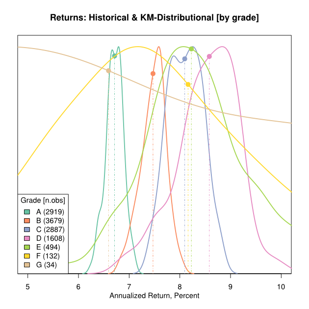
In all cases, even for smaller sample sizes, the historical observations occur near the modes of the density curves. This indicates that the survival curves are an extremely good summary statistic for the observed historical returns. In short,
a good estimate of a survival curve will provide a good estimate of portfolio returns
Algorithmic Overview
Algorithmic Overview
Our algorithm seeks to provide an estimate of the survival curve for each loan. We use an adaptation of the random forest specialized to survival analysis. The core random forest algorithm is well described in The Elements of Statistical Learning:
- Take B bootstrap samples of size N
- For each bootstrap sample, build a partitioning tree, \(T_b\):
- Select \(m < p\) variables from the \(p\) available covariates as split candidates.
- For each split candidate, determine a set of values on which to split the data into two disjoint sets.
- For each (split, value) tuple, compute some metric determining the goodness of split.
- Based on the best goodness of split, partition the data into two components and recurse.
- To score a loan \(k\) take the subset of trees in which the particular loan was not chosen in the bootstrap sample. Call this collection of trees \(\mathcal{T}_k\). These are the so-called out-of-bag (OOB) trees.
- For each OOB tree \(t\) in \(\mathcal{T}_k\), determine the leaf node \(l\) that contains the loan \(k\). \(l\) represents a subset of loans, namely those that weren’t separated by the partition induced by \(t\). Compute a Kaplan Meier estimate, \(S_{kt}\), of the survival curve based on the loans in the terminal leaf node \(l\).
- Take a (function) average of the \(S_{kt}\) over \(t \in \mathcal{T}_k\) to obtain a per-loan survival curve.
Hemant Ishwaran et al. suggests a number of goodness-of-split metrics for the survival analysis problem. The authors have also released an R package, randomSurvivalForest, to facilitate computation. However, we found that this package consistently crashed due to memory inefficiencies. For the 12,115 loans in our historical data set, a fairly small modeling problem, their code used all 16GB of RAM and 4GB of swap space on an 8-core Intel(R) Xeon(R) CPU E3-1230 V2 @ 3.30GHz computer. This forced the system to terminate the underlying R processes before completion.
We developed an alternative, memory efficient, multicore version of the algorithm that allowed us to customize the goodness-of-split metric around a C++, compiler optimized, log-rank statistic.
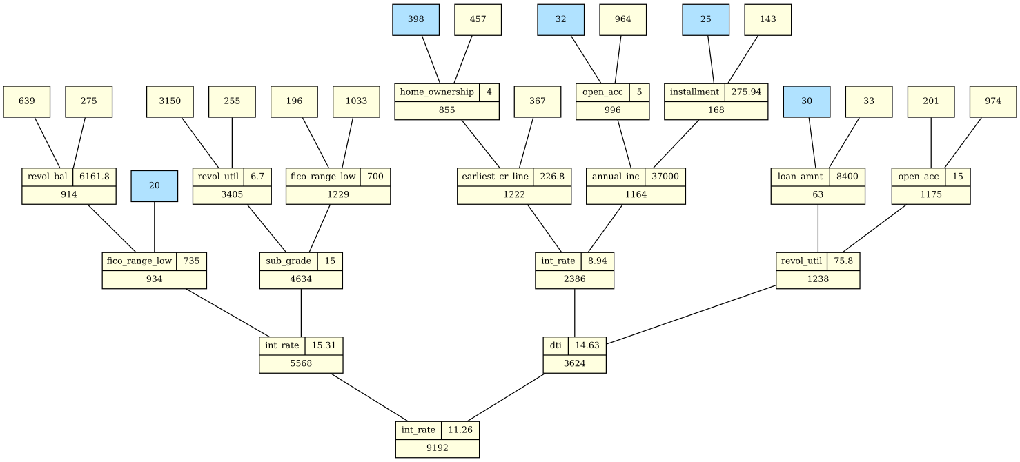
An example of a partially complete, partitioning tree is given in Figure 3. The yellow nodes show the splits. In each node, the number of loans to be partitioned is given. In many cases, the split variable and split condition are also shown. Not surprisingly, int_rate was the best split candidate a number of times. Blue nodes are terminal leaves. In many cases, they contain only a small number of loans. However, they can be large as well, as in the case of the leaf node with 398 loans. Various tuning parameters guide the process and ensure that each node will have a minimum number of defaults or, say, that terminal leaf nodes will be guaranteed to contain at least 20 loans.
Algorithmic Output
Algorithmic Output
It is instructive to visualize the output of the survival forest algorithm for at least a few specific loans. Figures 4, 5, and 6 do just that. Each OOB tree generates one of the black, survival curves plotted in each figure. In the notation introduced above, these are the \(S_{kt}\). These are averaged, pointwise, to obtain estimates of per-loan survival curves, in orange. The blue regions show the confidence band associated with 90% coverage.
What is most interesting about these three cases is the difference in the level of consensus among the trees. This can be understood as an indication of the within the model. For example, loan #567062 has good agreement across the OOB estimates; there is little prediction uncertainty. On the other hand, Loan #485099 has far more prediction uncertainty. As per the short discussion on bootstrap samples, the second of these loans is, evidently, quite sensitive to the particular sample used when building the OOB tree. As a result, we would tend to have less confidence in the survival curve estimate produced for this loan. The upside is that we obtain some feedback about the inherent model uncertainty.


For comparison, Table 2 shows the specific details of these three loans. In many ways the second and third loans, loan #485099 and loan #486576 respectively, look fairly similar. They share the same interest rate and same loan grade. FICO scores are also nearly identical. On close inspection, there are some differences to be found in dti and revol_util.
One likely explanation for the difference in prediction uncertainly might be the fact that the second loan, loan #485099, has properties that are somehow not self-consistent. When an OOB tree splits on one of these inconsistent attributes, particularly near the root, the results can be rather unstable. Another, more actionable, view of prediction uncertainty is that, for some loans, there just isn’t a strong signal that reflects risk, and an investor will probably want to avoid such wildcard loans.
Prediction Uncertainty and Variance of Returns
Prediction Uncertainty and Variance of Returns
The prediction uncertaintly shown in Figure 5 should be unsettling. We have an estimate, but perhaps little faith in its validity. All other things being equal, we would prefer a loan with less prediction uncertainty. At the very least, the algorithm is screaming at us to be wary.
To investigate this phenomena, we would like to borrow from Modern Portfolio Theory and plot expected returns against variance. So far, we have identified prediction uncertainty, a form of model non-consensus, as one component of total variance. A second component would be the variance suggested by the survival curve estimate itself which is, after all, a distributional characterization. To this end, we use a standard variance decomposition formula to recombine these two separate pieces of variability. This yields Figure 7. Note that we are showing properties of total return, over a full 36-month term, for single loans treated as static portfolios that are not actively managed.

On first glance, Figure 7 looks troublesome. Standard deviations are large relative to expected total returns. However, a well-diversified portfolio changes that perspective. Consider the red lines in the figure. These represent probabilistic loss boundaries for various portfolio sizes. For a given size, constructing a portfolio containing loans above the line will produce enough diversification to make the probability of a non-profit event 0.1%.
However, there is a disclaimer. This makes two strong assumptions: first, there is no correlation between defaults; and second, total return is normally distributed having the given mean and variance. There is no obvious, data-driven way to assess the first assumption, although it seems reasonable outside of some global economic catastrophy. The second assumption is false, but risk associated with the second assumption is less worrisome in large portfolios due to the Central Limit Theorem.
It seems safe to say that while 0.1% may be overly optimistic of a non-profit event, such an event is increasingly rare for larger portfolios.
More interestingly, if we use the red boundaries as our only condition for loan selection, we derive two immediate benefits. First, we can construct a good portfolio from scratch. At the beginning, start with less risky loans. As the portfolio grows, add the best loan available using the boundary appropriate for the current portfolio size. The second benefit is that once the portfolio gets large, the only criteria needed for choosing additional loans is expected returns.
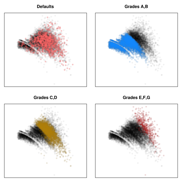
It is perhaps useful to view the scatterplot highlighting various loan classes, and we do this in Figure 8. These four plots are exact replicates of the one in Figure 7, but with particular loan classes highlighted.
In the first frame, we show defaults. There is nothing dramatically different between the distribution of defaulted loans and the full distribution. In particular, there are no obvious safe regions. A closer analysis will show that the marginal distribution of default standard deviation is slightly higher than the standard deviation of the whole. This is not particularly surprising, but it is a bit disappointing that the feature is not more conspicuous.
The next three frames show the loan grades. These show the general trend that reward increases with risk. However, there are plenty of grade-A and grade-B loans that have higher variance and lower expected return than ones found in the C and D grades. The latter would clearly make a better investment.
Optimal Portfolio Results
Optimal Portfolio Results
Using the ranking induced by our loan scoring metric discussed in the previous section, we can define new, performance-based classes of loans. The top 5% are denoted Gold; the next 10%, Silver; and the following 15%, Bronze. The classes are defined by their quantiles, so any future loan can be classified by its score. In particular, this makes it unnecessary to maintain a ranking relative to our historical training dataset. As more historical data becomes available, these class definitions could be updated if it were deemed useful.
We proceed by constructing successively nested portfolios. First, consider all the loans, taking nested subsets until only Gold and Silver remain, and finally only Gold loans are left in the portfolios. We call this portfolio inclusiveness in Figure 9. For each of these portfolios of historical loans, we compute the observed return had we been able to continuously reinvest in a like-basket of assets. This is just the actively managed portfolio computation applied to each nested subset of observations.
At 100% portfolio inclusiveness, we match the managed return computation as expected. As we become more and more selective, moving from right to left on the x-axis, our optimal portfolio begins to outperform portfolios based on loan grades. By the time we hit portfolios containing only Silver and Gold loans, we are in the 12% range claimed in the introduction.
In Figure 9, there is a slight deviation from the strict, performance-based nesting described above. In particular, we report portfolios built from scratch, using the portfolio initialization algorithm described above. Thus, the first few loans, about 0.3%, are not necessarily Gold performers. We felt that this provides a more honest view of the volatile, small sample behavior.
Figure 9 confirms that small portfolios are indeed plagued with higher variability. The dip in the curve in the Gold region is a prime example. This is simply an artifact of the decreasing sample sizes where default risk is less easily diversified across a smaller portfolio. For a portfolio containing a larger number of Gold loans, we might expect the trend to continue upward, somewhere upwards of 13 or 14% in the limit.

Our model obviously uses the covariate information in a fundamentally different way than does Lending Club. One might wonder which variables are most important in our optimal portfolio framework. The variable importance plot, an immediate byproduct of a random forest-type analysis, can be used to address these questions. See Figure 10.

Hands down, interest rate wins. This is not surprising; it is intended to be the embodiment of the risk to payoff ratio.
However, local historical unemployment rate, an external covariate imported from the Bureau of Labor Statistics is also surprisingly useful, coming in at number 4.
Surprisingly, perhaps, is that grade and subgrade are both in the bottom half. The FICO credit score, a highly touted risk variable inside the industry, is also middle of the pack here. One explanation for their poor showing is that interest rate already contains the information that matters. When the algorithm is determining a split node, and interest rate and loan grade are both candidates, interest rate is a finer grain metric and typically wins. That simply means that loan grade has fewer opportunities to accrue splits of significance.
Deploying the Model
Deploying the Model

Figure 11 shows the evolution of the performance-based loan classes since 2010, the end of our collection of historical data. It is odd that the growth of Gold loans have outpaced Silver and Bronze so significantly. Lending Club will tell you that this is due to increased standards for potential obligors. This would certainly be a happy situation. However, we have no evidence for or against the claim.
There is also the possibility that, in the intervening years, the meaning of a loan grade has shifted or the method by which interest rates are set has changed. Investors must ultimately decide to accept the risk of unknown changes in the platform in order to be comfortable basing decisions on historical data.
The other difficulty with Lending Club is that, although the platform is originating more loans than ever ($203.3m in September 2013), there are far more investors than obligors in the system. For a number of early investors, Lending Club has granted VIP access to their internal APIs. Some of these early investors are even rumored to have access to more detailed risk covariates than retail customers. Because Lending Club wants to protect the retail experience, access to the API is limited at best and unavailable at worst. My own experience was to be denied API access even when I only wanted to use it for deeper analytics.
The combination of these effects is to drain the availability of good retail loans. Many bloggers in the P2P lending community have bemoaned the fact that daily availability has dropped from hundreds of loans only months ago, to only a few tens of loans today. If more obligors can’t be recruited into the platform, laws of supply and demand suggest that the cost to invest in these loans should rise. That translates into an asset class that will create less value for retail investors in the long run.