
Dustin Lennon
Applied Scientist
dlennon.org
Uber Interview Challenge
My take on an Uber data-science assignment.
Dustin Lennon
October 2015
https://dlennon.org/20151003_uber
This work was originally published as an Inferentialist blog post.
Synopsis
Synopsis
An analysis done as part of a recent Uber interview, this post showcases a regularized logistic regression model used to assess customer retention.
Background
Background
This is the Uber Interview Challenge, a screening test for potential data science interview candidates. Supposedly, this should take three hours. However, in my professional career, I’ve never met anyone that could produce something like this in only three hours.
So, after investing far more than three hours in this effort, I decided that it would be most valuable to write up the analysis as a blog entry demonstrating the type of insights I strive to produce for my clients.
It’s admittedly a bit rough. However, I’m leaving for Utah early in the morning and it’s now quite late. Revisions to follow.
Enjoy.
Part 1: SQL
Part 1: SQL
The trips table
| column | type |
|---|---|
| id | integer |
| client_id | integer (fk: users.usersid) |
| driver_id | integer (fk: users.usersid) |
| city_id | integer |
| client_rating | integer |
| driver_rating | integer |
| status | enum(‘completed’, ‘cancelled_by_driver’, ‘cancelled_by_client’) |
| actual_eta | integer |
| request_at | timestamp with timezone |
The users table
| column | type |
|---|---|
| usersid | integer |
| character varying | |
| signup_city_id | integer |
| banned | Boolean |
| role | Enum(‘client’, ‘driver’, ‘partner’) |
| created_at | timestamp with timezone |
Queries
Between October 1, 2013 at 10a PDT and Oct 22, 2013 at 5p PDT, what percentage of requests made by unbanned clients each day were cancelled in each city?
As written, the question is, perhaps, misstated. Contrast with the following, potentially more meaningful variation: “For each city and day, between the hours of 10a PDT and 5p PDT, what percentage of requests made by unbanned clients were cancelled in each city.” As written, the first and last day are fundamentally different the other days in the interval, namely the first day misses all trips before 10a; the last day, all trips after 5p.
We provide an answer to the question as written.
A :=    SELECT *,
         date_trunc('day', request_at AT TIME ZONE 'PDT') AS day_id
      FROM trips
     WHERE request_at >= TIMESTAMP WITH TIME ZONE '2013-10-01 10:00:00 PDT'
       AND request_at <= TIMESTAMP WITH TIME ZONE '2013-10-22 17:00:00 PDT'

B :=    SELECT *
      FROM users
     WHERE banned = FALSE
       AND role = 'client'

C :=    SELECT *
      FROM A
      INNER JOIN B
        ON A.client_id = B.usersid

D :=    SELECT
        SUM(
            CASE WHEN status='cancelled_by_driver' THEN 1
                 WHEN status='cancelled_by_client' THEN 1
                 ELSE 0
            END
           ) AS cancelled_count,
        COUNT() AS total_count,
        city_id,
        day_id
    FROM C
    GROUP BY city_id, day_id

E := SELECT
      city_id,
      cancelled_count / total_count::float AS percent_cancelled
    FROM D;
The above query is pulled apart into its constituent components for clarity. Combining these pieces into a single query is messy, but trivial.
For city_ids 1,6, and 12, list the top three drivers by number of completed trips for each week between June 3, 2013 and June 24, 2013.
A := SELECT
    *,
    extract(day from
        age(
            date_trunc('day', request_at),
            date_trunc('day', '2013-06-03')
        ))::int / 7 AS weeks_since_id;

     FROM trips
    WHERE request_at >= '2013-06-03'
      AND request_at < '2013-06-25';

B := SELECT
        driver_id,
        city_id,
        weeks_since_id
        COUNT(*) AS trips_taken
    FROM A
    WHERE city_id IN (1,6,12)
    GROUP BY city_id, weeks_since_id;

C := SELECT
        driver_id,
        city_id,
        weeks_since_id,
        trips_taken,
        RANK() OVER (
            PARTITION BY city_id, weeks_since_id
            ORDER BY trips_taken
            DESC) AS driver_rank
    FROM B

D := SELECT
        city_id,
        weeks_since_id,
        driver_rank,
        driver_id,
        trips_taken
    FROM C
    WHERE driver_rank <= 3
    ORDER BY city_id, weeks_since_id, driver_rank;
The above query is pulled apart into its constituent components for clarity. Combining these pieces into a single query is messy, but trivial.
Part 2: Experiment and Metrics Design
Part 2: Experiment and Metrics Design
A product manager on the Growth Team has proposed a new feature. Instead of getting a free ride for every successful invite, users will get 1 Surge protector, which exempts them from Surge pricing on their next surged trip.
What would you choose as the key measure of the success of the feature?
Given that the feature has been proposed by the Growth Team, the key measure of success should reflect an increase in the size of the user base. To that end, I would define the KPI as the number of successful invites per user.
The count of successful invites would be computed per user and averaged over the users in each flight. Users would be triggered into the experiment, say, when they complete their next ride, and the counts of successful invites would be tracked over a fixed time horizon, say, two weeks, following the triggered event.
What other metrics would be worth watching in addition to the key indicator?
There are at least a few guardrail metrics that would be worth watching. For example, we would certainly want to monitor the following user-level metrics: revenue per user and rides per user. Significant changes here could indicate a serious problem with the experiment and might warrant shutting down the experiment all together.
However, the proposal gives the user an opportunity to choose a time at which to maximize a discount. This could lead to a change in user behavior.
Suppose that the proposal is constrained so that the discount applies to a user’s next ride in the “free ride” flight and to a user’s next Surge ride in the “Surge Protector” flight. It is possible that this would impact a user’s time to return to the service. We could measure this by recording the time lag to the next trip per user.
Suppose, alternatively, that a user is free to choose when to use the “free ride” or the “Surge Protector.” Then, we would want to measure the cost, in dollars to Uber, of that incentive when executed. Call this metric the cost of incentive per user.
Describe an experiment design that you could use to confirm the hypothesis that your chosen key measure is different in the treated group.
Suppose that users are exposed to one of three messages when they complete a trip.
- Thanks for using Uber. Please recommend us to a friend.
- Thanks for using Uber. Please recommend us to a friend: we’ll give you a free ride.
- Thanks for using Uber. Please recommend us to a friend: we’ll give you a Surge Protected ride.
We might refer to these, respectively, as the control, the free ride flight, and the Surge Protected flight.
We consider a user to be triggered when they receive this message. The first time they are eligible, they should be randomized into one of the three flights. This assignment should be persisted throughout the experiment. In the event of previous experiments, it is a requirement to ensure that users will be re-randomized and, therefore, not subject to any biases resulting from previous experiments.
To improve power, users that are never triggered will be removed from the metric calculations. To that end, metrics should be computed per user and then averaged over the triggered user population.
We are interested in testing a collection of hypotheses. Consider pairwise comparison of each of the flights. Since the metrics are averages over iid users (assuming we randomized correctly), we know the corresponding asymptotic distributions should be normal, and a simple z-test will suffice to determine statistical significance.
Typically, it is most useful to build a scorecard that tracks and compares the various metrics. The scorecard will have raw statistics as well as the respective p-values on which a decision will ultimately rest.
Three omissions from the above are worth mentioning:
In the classical situation described here, we need to consider experimental power. Effectively, this maps the minimal detectable difference in a metric to the number of observations required. This impacts the length of the experiment. More modern approaches will track p-values over time and permit “peeking” at the experimental results before satisfying the power condition.
For a risky experiment, we may not want to expose the whole population at once. If the traffic is high enough, we can often get away with a lower exposure rate and still satisfy a reasonable time to completion.
With additional metrics beyond the KPI, there is exposure to the multiple hypothesis testing problem. Effectively, p-values become less reliable as the number of tests increases. Here, the number is relatively small: a few metrics and a few flights. Classical results recommend a Bonferonni-type correction which is, often, overly conservative. Again, more modern options, e.g. false discovery rate, could be used alternatively.
Part 3: Data analysis
Part 3: Data analysis
Uber is interested in predicting rider retention. To help explore this question, we have provided a sample dataset of a cohort of users who signed up for an Uber account in January 2014. The data was pulled several months later; we consider a user retained if they were “active” (i.e. took a trip) in the preceding 30 days.
We would like you to use this data set to help understand what factors are the best predictors for retention, and offer suggestions to operationalize those insights to help Uber.
See below for a detailed description of the dataset. Please include any code you wrote for the analysis and delete the data when you have finished with the challenge.
| column | description |
|---|---|
| city | city this user signed up in |
| phone | primary device for this user |
| signup_date | date of account registration; in the form ‘YYYY-MM-DD’ |
| last_trip_date | the last time this user completed a trip |
| avg_dist | the average distance (in miles) per trip taken in the first 30 days after signup |
| avg_rating_by_driver | the rider’s average rating over all of their trips |
| avg_rating_of_driver | the rider’s average rating of their driers over all of their trips |
| surge_pct | the percent of trips taken with surge multiplier > 1 |
| trips_in_first_30_days | the number of trips this user took in the first 30 days after signing up |
| uber_black_user | TRUE if the user took an Uber Black in their first 30 days; FALSE otherwise |
| weekday_pct | the percent of the user’s trips occurring during a weekday |
Perform any cleaning, exploratory analysis, and/or visualizations to use the provided data for this analysis ( a few sentences/plots describing your approach will suffice). What fraction of the observed users were retained?
Basic Summary Statistics
First:
- load a few libraries
- import the json
- restructure the data.frame and,
- output the usual R summary.
summary(mydf)
            city       trips_in_first_30_days  signup_date
Astapor       :16534   Min.   :  0.000        Min.   :2014-01-01
King's Landing:10130   1st Qu.:  0.000        1st Qu.:2014-01-09
Winterfell    :23336   Median :  1.000        Median :2014-01-17
                       Mean   :  2.278        Mean   :2014-01-16
                       3rd Qu.:  3.000        3rd Qu.:2014-01-24
                       Max.   :125.000        Max.   :2014-01-31

avg_rating_of_driver   avg_surge     last_trip_date           phone
Min.   :1.000        Min.   :1.000   Min.   :2014-01-01   Android:15022
1st Qu.:4.300        1st Qu.:1.000   1st Qu.:2014-02-14   iPhone :34582
Median :4.900        Median :1.000   Median :2014-05-08   NA's   :  396
Mean   :4.602        Mean   :1.075   Mean   :2014-04-19
3rd Qu.:5.000        3rd Qu.:1.050   3rd Qu.:2014-06-18
Max.   :5.000        Max.   :8.000   Max.   :2014-07-01
NA's   :8122
  surge_pct      uber_black_user  weekday_pct        avg_dist
Min.   :  0.00   Mode :logical   Min.   :  0.00   Min.   :  0.000
1st Qu.:  0.00   FALSE:31146     1st Qu.: 33.30   1st Qu.:  2.420
Median :  0.00   TRUE :18854     Median : 66.70   Median :  3.880
Mean   :  8.85   NA's :0         Mean   : 60.93   Mean   :  5.797
3rd Qu.:  8.60                   3rd Qu.:100.00   3rd Qu.:  6.940
Max.   :100.00                   Max.   :100.00   Max.   :160.960

avg_rating_by_driver     active
Min.   :1.000        Min.   :0.0000
1st Qu.:4.700        1st Qu.:0.0000
Median :5.000        Median :0.0000
Mean   :4.778        Mean   :0.3761
3rd Qu.:5.000        3rd Qu.:1.0000
Max.   :5.000        Max.   :1.0000
NA's   :201
Note that there are several columns with maximum values far greater than the mean / median. The big missing data issue is the 8122 records that are missing values for avg_rating_of_driver, and a few missing values from phone and avg_rating_by_driver.
Make some boxplots to visualize the well-ordered columns. These are on different scales, but the adhoc, "1.5*IQR" rule identifies a number of columns that appear to have outliers.
par(mar=c(10,3,3,1), las=2)
boxplot(mydf[,ordered.column.names], main="IQR Outliers")
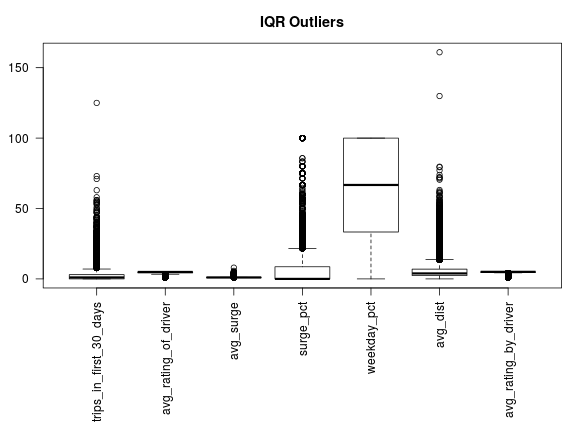
If we remove all records that contain a column with an “outlier” as defined by the 1.5*IQR rule, we wind up omitting more than half the data.
How many good records are there?
selected = rep(TRUE, nrow(mydf))
selected = selected & complete.cases(mydf)
for(colname in ordered.column.names){
    coldata = mydf[,colname]
    rng = range(boxplot.stats(coldata)$stats)
    rng.test = (rng[1] <= coldata & coldata <= rng[2])
    if(length(rng) == 2){
        selected = selected & rng.test
    }
}

sum(selected)
[1] 24733
We revisit this issue when we describe the statistical model.
Independence and Missingness
Before proceeding, we should first investigate any dependencies in the covariates. We should also consider whether data is missing at random. To this end, we discretize well-ordered covariates by quantile. Consider a quick example.
xtab = xtabs(~ city + trips_in_first_30_days, data=fact.df)
ptbl = prop.table(xtab, margin=1)
print(xtable(ptbl), type="html", digits=2)
| City | [0,1] | (1,2] | (2,3] | (3,125] |
|---|---|---|---|---|
| Astapor | 0.63 | 0.15 | 0.07 | 0.15 |
| King's Landing | 0.57 | 0.14 | 0.08 | 0.21 |
| Winterfell | 0.57 | 0.15 | 0.08 | 0.20 |
The columns are the quantile cut points for trips_in_first_30_days. Note that Astapor has 63% of users taking 0 or 1 rides in the first 30 days; Winterfell, 57%. On the high end, Astapor has 15% of users taking between 3 and 125 rides in the first 30 days; King’s Landing, 21%. Moreover, these differences are statistically significant.
In fact, this example is typical: all the covariate pairs have strong statistically significant dependencies. We show only the top 10 p-values below.
         ~trips_in_first_30_days+weekday_pct
                                           0
~avg_rating_of_driver+trips_in_first_30_days
                                           0
           ~avg_rating_of_driver+weekday_pct
                                           0
                        ~avg_surge+surge_pct
                                           0
                      ~avg_surge+weekday_pct
                                           0
                      ~surge_pct+weekday_pct
                                           0
            ~avg_dist+trips_in_first_30_days
                                           0
                       ~avg_dist+weekday_pct
                                           0
              ~avg_dist+avg_rating_by_driver
                                           0
~avg_rating_by_driver+trips_in_first_30_days
                                           0
However, this statistical significance is perhaps not particularly surprising given the large sample size.
We similarly consider missingness. We want to know if the presence of NAs informs our understanding of other distributions. This is, indeed, the case. First, an example:
ii = "avg_rating_of_driver"
jj = "trips_in_first_30_days"
form = paste("~", ii,"+", jj,sep="")

col.levs = levels(fact.df[[jj]])
row.levs = levels(fact.df[[ii]])
n.levels = length(row.levs)
na.f = as.numeric(margin.table(xtabs(form, data=fact.df)[-n.levels,], margin=2))
na.t = as.numeric(margin.table(xtabs(form, data=fact.df)[n.levels,,drop=FALSE], margin=2))

tbl = rbind(na.f, na.t)
colnames(tbl) = col.levs
rownames(tbl) = c("isNA.false", "isNA.true")
prop.table(tbl, margin=1)
               [0,1]      (1,2]       (2,3]      (3,125]
isNA.false 0.5196523 0.16877597 0.089378671 0.2221930369
isNA.true  0.9524748 0.04112288 0.005540507 0.0008618567
As shown above, when NA is true, there is a far greater chance that a rider took only 0 or 1 trips in the first 30 days. Like the dependencies shown above, NAs are not missing at random. The top 10 are shown below with associated p-values.
~avg_rating_of_driver+trips_in_first_30_days
                                0.000000e+00
           ~avg_rating_of_driver+weekday_pct
                                0.000000e+00
              ~avg_rating_of_driver+avg_dist
                               3.563902e-221
             ~avg_rating_of_driver+avg_surge
                               2.087450e-127
             ~avg_rating_of_driver+surge_pct
                               1.125126e-120
           ~avg_rating_by_driver+weekday_pct
                                2.248599e-35
~avg_rating_by_driver+trips_in_first_30_days
                                2.039062e-27
                  ~avg_rating_of_driver+city
                                4.039247e-27
                      ~phone+uber_black_user
                                8.354827e-22
       ~avg_rating_of_driver+uber_black_user
                                2.745450e-16
Build a predictive model to help Uber determine whether or not a user will be retained. Discuss why you chose your approach, what alternatives you considered, and any concerns you have. How valid is your model? Include any key indicators or model performance.
We might fit a model based on the selection criteria discussed above, but we’ll be missing all the extreme cases. In fact, it is exactly the extreme cases that we want to understand. For example, does a really bad surge_pct drive away customers? If we suspect that it does, we need to retain this information in the model in some capacity.
One possibility is to recode each column as a 3-tuple.
\[\{I(X < x_l), max(x_l, min(X, x_h)), I( X > x_h )\}\]
This clips any value that exceeds the whiskers in the boxplot. If the value was censored in this way, either high or low, the associated indicator function will be “on.” Thus, we sacrifice a little bit of efficiency / bias for a more robust model that retains the notion of a “bad experience”.
Here is the R code that does the recoding and builds a normalized model matrix:
model.columns = c(
    "city",
    "trips_in_first_30_days",
    "avg_rating_of_driver",
    "avg_surge",
    "phone",
    "surge_pct",
    "uber_black_user",
    "weekday_pct",
    "avg_dist",
    "avg_rating_by_driver",
    "active"
    )

censored.df = mydf[complete.cases(mydf),model.columns]
for(colname in setdiff(ordered.column.names, "active")){
    coldata = censored.df[,colname]
    rng = range(boxplot.stats(coldata)$stats)

    low = rng[1]
    high = rng[2]

    low.colname = paste(colname, "low", sep=".")
    high.colname = paste(colname, "high", sep=".")

    censored.df[,low.colname] = as.numeric(coldata < low)
    censored.df[,colname] = pmax(low, pmin(high, coldata, na.rm = TRUE), na.rm = TRUE)
    censored.df[,high.colname ] = as.numeric(coldata > high)
}

fact.ind = sapply(censored.df, is.factor)
mm = model.matrix(~ . -1 -active,
    data=censored.df,
    contrasts.arg = lapply(censored.df[,fact.ind], contrasts, contrasts=FALSE)
    )

## normalize the non-indicator columns so that coefficients are comparable
center.columns = c(
    "trips_in_first_30_days",
    "avg_rating_of_driver",
    "avg_surge",
    "surge_pct",
    "weekday_pct",
    "avg_dist",
    "avg_rating_by_driver"
    )
mm.center = mm
for(colname in center.columns){
    mm.center[,colname] = scale(mm[,colname])
}
Note that we select “complete.cases” here, which drops us down to 41,445 of the 50,000 records.
As a quick check, we investigate the rank of the model matrix, and determine it to be around 18.
 [1] 1.000000e+00 1.521596e-01 6.318974e-02 3.686950e-02 2.691849e-02
 [6] 9.086671e-03 8.742047e-03 6.987768e-03 6.708763e-03 5.551017e-03
[11] 3.653912e-03 3.415143e-03 2.917938e-03 2.813958e-03 2.472845e-03
[16] 2.175711e-03 6.546438e-04 1.618190e-04 1.202418e-15 8.663041e-17
[21] 8.663041e-17 8.663041e-17 8.663041e-17 8.663041e-17 8.663041e-17
[26] 8.663041e-17 8.663041e-17
The Model
Because we have a high degree of dependency and a rank deficient design matrix, we need to be thinking about regularlizing the results of any interpretable regression model. A good choice is a logistic regression with an elastic net penalty. A useful implementation is available in the glmnet package. In what follows, we take \(\alpha=1\). This corresponds to the well-known Lasso penalty.
Fitting such a model is fairly straightforward. We break the data into training and test sets. We run a cross validation on the training set to determine the penalty parameter. Finally we compute predicted classes on the test set to derive a confusion matrix.
Training / Test Data
set.seed(1234)
shuf = sample(nrow(censored.df))
n.train = floor(2/3 * nrow(censored.df))
train.data = list(
    x = mm.center[shuf[1:n.train],],
    y = censored.df[shuf[1:n.train], "active"]
    )
test.data = list(
    x = mm.center[shuf[(n.train+1):nrow(censored.df)],],
    y = censored.df[shuf[(n.train+1):nrow(censored.df)], "active"]
    )
Fitting the model
fit = glmnet(train.data$x, train.data$y, family="binomial")

cvfit = cv.glmnet(
    train.data$x, train.data$y,
    family = "binomial",
    type.measure = "class",
    parallel = TRUE
    )
The cross validation plot shows the expected prediction error:
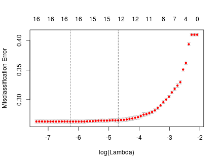
The table below shows “active”, normalized coefficients for the value of \(\lambda\) that maximizes the amount of regularlization and is within one standard error of the MSE optimal \(\lambda\). It is the right-most, gray line in the figure above.
| covariate | estimate |
|---|---|
| cityKing's Landing | 1.1262 |
| uber_black_userTRUE | 0.7521 |
| avg_surge | 0.4571 |
| trips_in_first_30_days.high | 0.3017 |
| trips_in_first_30_days | 0.1349 |
| avg_surge.high | -0.3791 |
| avg_dist.high | -0.4155 |
| cityAstapor | -0.4182 |
| avg_rating_by_driver | -0.4373 |
| surge_pct.high | -0.7840 |
| phoneAndroid | -0.9433 |
| avg_rating_by_driver.low | -1.2036 |
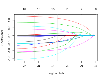
The next figure shows how the normalized coefficients taper off as the regularization penalty increases. At the rightmost gray line, the order of the above table matches the order of the series in the figure.
Finally, we make predictions on the test set, and report the quality of the fit:
v = predict(fit, newx = test.data$x, type="class", s=cvfit$lambda.1se)
v.pred = as.numeric(v)
v.true = test.data$y

tbl = xtabs(~ v.true + v.pred)
tbl
      v.pred
v.true    0    1
     0 6739 1362
     1 2313 3401
prop.table(xtabs(~ v.true + v.pred), margin=2)
      v.pred
v.true         0         1
     0 0.7444764 0.2859542
     1 0.2555236 0.7140458
class.err = 1 - sum(diag(tbl)) / sum(tbl)
class.err
[1] 0.2660152
Briefly discuss how Uber might leverage the insights gained from the model to improve its rider retention.
Recall the above table with the “active”, normalized coefficients. Because of the apriori normalization of non-indicator columns, the coefficients are unitless and comparable.
We see that being from King’s Landing has the highest impact. If we take the usual interpretation of a logistic regression coefficient, this implies that, all other things being equal, being from King’s Landing increases the log odds of an active user by 1.12. This translates into a 3x increase in the odds of an active Uber customer. In short, King’s Landing is a good market for Uber. In contrast, Astapor is not a good market for Uber.
The next two coefficients are, perhaps, at first a little surprising. avg_surge and uber_black_userTRUE are both positively correlated with increase in active status. However, these can be interpreted as indicators that a user has bought into the Uber value proposition; they are a regular. Similarly, the censor indicator, trips_in_first_30_days.high, suggests the same. An abnormal number of trips in the first 30 days is probably a good indicator of a long term customer.
We see some payoff in our censored variables with avg_surge.high and surge_pct.high. For customers that are outliers in these categories, Uber isn’t a great value, and the model confirms this.
Another insight is about phoneAndroid. Marginally, the odds that an Android user is active is about 39% of the odds that an iPhone user is active. This suggests that the Android experience is far less compelling than the iPhone. This probably warrants further investigation.
The last insight is that if a driver rates a passenger so low as to be an outlier, they are far less likely to be an active customer six months later. This is probably indicative of a bad experience between driver and rider.