Dustin Lennon
Applied Scientist
dlennon.org
An Introduction to pytrope.matplotlib_extras
This notebook serves as an introduction to the pytrope.matplotlib_extras package.
Dustin Lennon
October 2019
https://dlennon.org/20191007_pytrope
An Introduction to pytrope.matplotlib_extras
An Introduction to pytrope.matplotlib_extras
This module provides matplotlib helper functions for jittering data, adjusting colorbar height, and adding captions. There are also simple classes extending locator and formatter objects for clipped data.
source code on github
The source repository is hosted on github, available at https://github.com/dustinlennon/pytrope.
# basic imports
from matplotlib import cm, pyplot as plt
import matplotlib.colors as mcolors
import numpy as np
import pandas as pd

import pytrope.matplotlib_extras
# read the data
url = "https://dlennon.org/assets/data/d123630cfabeca3a24fb8e6303ff9468.bz2"
df = pd.read_csv(url)

# construct the series of interest
vx = df.all_trips
vy = df.pc_trips
vcolor = (1 - vy / vx)
pcolor = 100 * vcolor
# Set up a colormap; define a normalizer for percentages on a [0,100] scale; set a default figure size
cmap  = cm.jet
norm = mcolors.Normalize(vmin=0, vmax=100)
plt.ioff()
plt.rc("figure", figsize=(8,8))
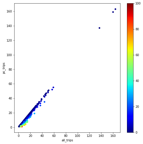
Pandas Scatterplot, Default Settings
Pandas Scatterplot, Default Settings
The default scatterplot in pandas leaves a lot to be desired. The biggest issue is that the data is so spread out as to be uninformative for our purposes.
# Default pandas scatter plot
fig = plt.gcf()
fig.clf()
ax = df.plot.scatter('all_trips', 'pc_trips', c=pcolor, colormap=cmap, norm=norm, ax=fig.gca())
ax.figure
A Better Visualization
A Better Visualization
clip and jitter
Oddly, I couldn’t find a general jittering function in matplotlib. So, pytrope includes one.
# Clip x and y values
clip_range = [0,11]
cx = np.clip(vx, *clip_range)
cy = np.clip(vy, *clip_range)

# [pytrope.matplotlib_extras] Jitter the clipped x and y values
jcx = pytrope.matplotlib_extras.jitter(cx, abs_jit = 0.75)
jcy = pytrope.matplotlib_extras.jitter(cy, abs_jit = 0.75)
scaling percentages
Some folks lose their minds when percentages are expressed as values in [0,1]. We make an adjustment so that the labels on the colorbar will run from 0 to 100. This requires that we pass a Normalize object to the matplotlib scatter function.
# Create a scatter plot with a color index
fig = plt.gcf()
fig.clf()
ax = fig.gca()
scatter_kw = {
'alpha' : 1,
'c' : pcolor,
'cmap' : cmap,
'norm' : norm,
'edgecolor' : None,
's' : 4
}
ax.scatter(jcx, jcy, **scatter_kw)
# labels
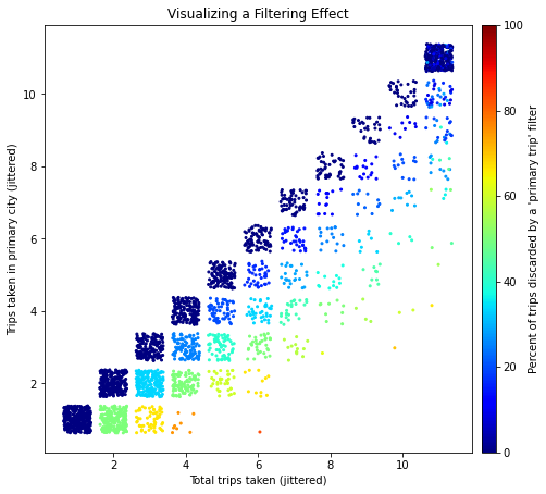
ax.set_title('Visualizing a Filtering Effect')
ax.set_xlabel('Total trips taken (jittered)')
ax.set_ylabel('Trips taken in primary city (jittered)')
ax.set_aspect(1.)
ax.figure
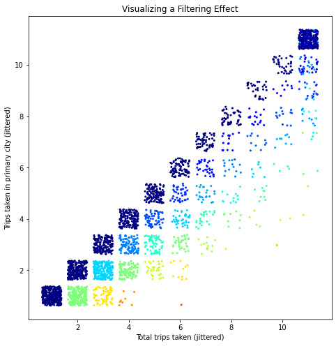
Above, we already have a much more informative visualization. Let’s add a colorbar to keep moving forward.
adding a colorbar
# add a color bar
scalar_mappable = cm.ScalarMappable(norm=norm, cmap=cmap)
cbar = fig.colorbar(scalar_mappable,
  ax=ax,
  pad=0.02,
  fraction=0.1,
  aspect=30
  )
cbar.set_label("Percent of trips discarded by a 'primary trip' filter")
ax.figure
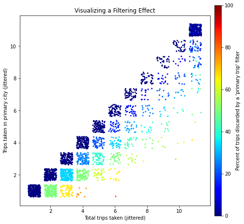
adjusting colorbar height
It’s annoying that the colorbar extends beyond the original axes. pytrope provides a function to adjust the second axes that was created for the colorbar.
# [pytrope.matplotlib_extras]: adjust the color bar
pytrope.matplotlib_extras.adjust_colorbar(cbar, ax)
ax.figure
Visually, that looks a lot better.
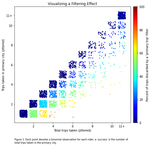
formatter and locator for clipped data
However, our figure should also indicate that we applied a clipping operation to our raw data. We make this adjustment using the ClippedFormatter and ClippedLocator classes included with pytrope.
# [pytrope.matplotlib_extras]: annotate tick marks for clipped values
for axis in [ax.xaxis, ax.yaxis]:
  formatter = axis.get_major_formatter()
  locator   = axis.get_major_locator()

  clipped_formatter = pytrope.matplotlib_extras.ClippedFormatter(clip_range, formatter)
  clipped_locator   = pytrope.matplotlib_extras.ClippedLocator(clip_range, locator)

  axis.set_major_formatter( clipped_formatter  )
  axis.set_major_locator( clipped_locator )

ax.figure
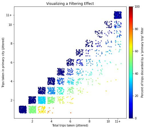
This is subtle, but the previous figure now includes an “11+” on the x- and y-axes. This will function as a visual cue for the viewer.
add captions to matplotlib figure
Finally, we add a caption to add an explanation of what each plotted dot represents. The code takes a string and breaks it into pieces that are no wider than the width of the axes.
# [pytrope.matplotlib_extras]: add a caption
txt = """
  Figure 1: Each point denotes a binomial observation for each rider; a 'success' is
  the number of total trips taken in the primary city.
"""
pytrope.matplotlib_extras.add_caption(txt, ax, fontsize=8)
ax.figure